Tuesday 3 December 2013

Audience Feedback

Now that we have finished editing, we showed a group of our peers our video to see what our target audience thinks of the video. I wrote a questionnaire consisting of 12 questions asking for the audience's opinion on various elements of our video:


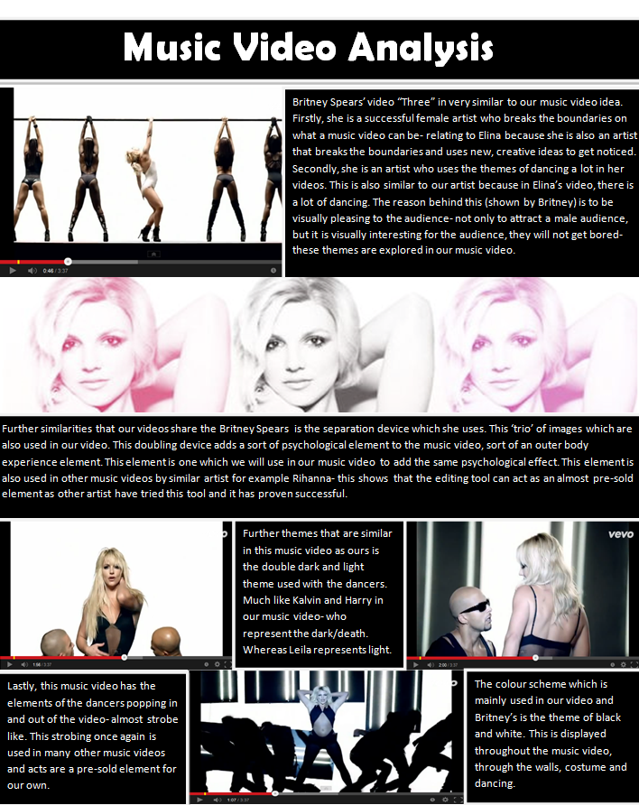
Overall, the feedback from our audience was really positive, they all seemed to really enjoy it, so we have successfully created a video to reach a specific target audience. When we asked the audience to give an overall view of the video people called it 'different', 'creative', 'origional' and 'trippy', this feedback really pleased us, as it was the sort of thing we were going for in terms of an overall idea. Most people's favourite part was the projected images on Elina, they found this section interesting and unusual as it was in keeping with the rest of the video but it was also unexpected, they especially liked the projections of the mushrooms growing because of the exotic colours and wild movements.
I was intrigued by what the audience would say could be improved on so we included this question in the questionnaire, one comment made was that we could have included some more interesting camera movements to add more movement to the video, this was an interesting comment and thinking about it, our video could have benefited from a variety of movements but during editing we did have some pans but we took them out as we did not think they worked effectively, so we should have perhaps included some zooms to see how they would work. The audience also suggested that we include some more footage of 'white Lelia' because we only used her in the second dance break, but we did try this during the editing, but as I discussed in the editing post, the footage didn't work very well at the beginning, so we used more on 'black Lelia' instead.
Everyone really liked the fast paced editing, even when they were asked if they think it should be slowed down at all, they said no as the editing pace makes it really exciting and thrilling. This was an area we were concerned about because we didn't know if there was too much going on making our video overwhelming, but our concerns were put to rest when the audience said that they thought the editing pace was great. We were interested in what the audience thought the dancers and paint represented, to see if we had made it clear enough in the video, most of the audience thought that the dancers represented the chaos of Elina's mind, an erotic past or even ghosts. So there was quite a few opinions regarding the dancers, this shows us that we could have made that element clearer, but most of the audience did agree that they did resemble a sort of chaotic character which is an accurate idea of what they did portray so that was encouraging. When it came to the paint, most people thought that it resembled life and death, with the gold paint signifying Elina's soul, we were really pleased that this element was picked up as it helps the audience understand the theme of the entire video as well as just those elements. Overall, the audience did say that they believed the paint and the dancers really helped contribute to the theme of life and death, and additional things such as the projections just emphasised the idea.
The audience said that they thought our set was really well structured which made it seem 'out of this world', this was pleasing as we did spend a long time getting all the measurements of the lines to be equal so that the set would be symmetrical and thus give the whole video an surreal/trippy feel to it. One thing the audience did point out is that would could have made more use of lighting, they felt that other then the strobe in the dance break we didn't do many other exciting lighting effects, this is a fair point but we did originally plan to have blinders, they just didn't turn out the way we wanted them to, hence they were not included, but we should have added in an extra lighting effect in order to substitute for the loss of the blinders.
Everyone believed that the video was cast perfectly, with Elina suiting the song and the dancers being able to dance well, and this we agreed with, we were so pleased with who we picked for our video as they worked so well on the day and they made our video what it is. The audience said that we should have included more footage of the male dancers, but we had always said that we only wanted them on during the dance break, and this is the way we kept it, we did try and use them elsewhere, but it didn't work well, so despite the criticism, we are glad we kept it the way it is. Another thing the audience said was not clear enough was the road that Elina lies on at the beginning and the end, they just didn't believe that it was a road and were confused as to what it was, they suggested we added some white lines in order to make it clearer. We accepted this criticism and knew it was likely to be an issue, but the post production editing would have been too complex to create a road like setting, so we had to compromise.
All in all, we asked what the audience would score our video out of 10 and if they saw it on TV would they continue to watch, 100% of the audience said they would continue to watch and we scored and average of 9/10 for overall scores. We were really pleased with the audience feedback and we are interested in what external feedback we get once the video goes on youtube.

Thursday 28 November 2013

Editing DONE

We have now completed the editing process. Overall this process was stressful as at times it was difficult to imagine what the video would eventually look like, but it was also enjoyable as it was exciting to see all our hard work come together.
We were pleased with the rough cut but the next stage of editing was all about percicsion. So we went through our timeline frame by frame to make sure that the cuts were in the beat to the music. We would put a marker (the marker creates a snap-point on the timeline or on a clip that the playhead will lock onto) exactly where each beat is and then we would line up the clips to the marker so that the clips would cut on beat. This was a slow process as it required a lot of attention to detail, but most of the time we were only a few frames out so no serious changes were made. Once this was done the whole thing looked far sharper.
We then watched through the video a few times to ensure that all the footage we used was the best quality. It was bought to our attention that there were a few clips which were out of focus, and although these were not really noticable, we still wanted to change them so that our video would be the best it could be. So we located the faulty clips, delted them and then replaced them with better quality footage, but we had to ensure that the clips we added fitted in with the music and the other footage before and after it. Once this was done we were finished with the offline work and it was time to move onto the online work to do tidy the whole thing up.
The online work consists of the nitty-gritty editing where we get rid of an sections of a clip which are not good. We initally worked on the opening and ending footage of the paint on Elina. We started by getting rid of the cup which was accidentily in the clip for a few seconds, we had to highlight this area and then remove it and replace it with something else. We then adjusted the settings of the clip in order to make the gold paint more prominant, as orgionally it was a bit dull and not very noticable. So as this is a key element of our video we wanted to highlight it so that it was clear. Lastly, we worked on improving the texture of the floor so that it portrayed a road more convincingly, so we worked on developing a concrete/gravil texture and then we replaced it for the orgional studio floor thus giving the illusion Elina is lying on a road. 
After all this post production our video was completed and we were really proud of it as we thought it looked really interesting and professional. We have had some really positive comments from people who have been watching us create it and we are really excited to show it to our target audience and see what they think.


Thursday 21 November 2013

Editing so far

We have now begun the slow process of editing our music video. After loading all the footage onto final cut pro, organising the clips into different 'rush' bins based on the setting they were shot it, we began to sync up the lip singing. This was a difficult task as we became aware that our singer didn't get the words that accurate, so we had to chop and change the different clips in order to ensure there was always accurate lip singing on camera. We decided to keep the cutting slow at the beginning in order to build up to the chaos at the dance break, otherwise the whole video would be quick cuts and would get boring. When putting in the clips with the projected images, we came across another problem, we discovered that most of the clips were shot in the second half of the time frame of the video, so we had limited footage for the first half of the video, this required us to be selective about where to put the footage so that it would have an effective impact. As we worked towards syncing the end of the video where we had planned to use the setting with blinders, we decided that this setting really wasn't in keeping with the rest of the video, it was too 'pop video' like, and our video is more edgy and dancy, although the footage was nice and Elina looked amazing, we decided to not include it in order to keep our video within the one genre.


Secondly we added the dance element. This was an exciting part of editing as it really bought our video to life as the idea of chaos was introduced and Lelia played the role of Elina's temptress, toying with her emotions in limbo. Initially we put clips of Lelia alone, painted in white, into the first verse of the video. We then introduced the boys and Lelia in black for the dance break. But as we watched through that first chunk of the video with the dancers, we realised that the white didn't really work well in the initial verse as it didnt feel as if Lelia was a serpent type character due the fact that she was white and this signifies purity and innocence. We then replaced the white footage of Lelia alone to black footage of Lelia alone and this worked far better, so although it is not in keeping with our timeline, we have decided to use this black footage as it looks better as it made Lelia appear more devil-like and showed that she was trying to tempt Elina. We then added more dance footage to the second half of the song, as the editing pace increases at this point we were able to introduce more quick cuts of the dancers, this helps us target our specific audience as they would be expecting these quick cuts that match the beat of the music and it links Elina and the dancers together well. When it came to the second dance break we had originally planned to have super quick cuts between the white and black footage of the dancers, so that it appeared that the boys were vanishing and reappearing, but there was an issue with lack a continuity between the two clips, so that they do cut into each other accurately. But we put the footage on anyway to see if it would be a massive issue, and it turned out that it worked really well, the clips are not massively out of time with each other, and so cutting between the two adds to the erratic-ness of limbo.


Tuesday 5 November 2013

The Iconography of the Album Cover

The art of the album cover is a curious one, part packaging, part advertising, often an insight into an artist's worldwide view and usually the happy result of a successful collaboration between creative minds, the best album cover art illustrates and accompanies the music in a way that creates the whole package. Julian House who is a creative partner at London creative agency, The Intro Partnership, speaks about how most of the direction for the album must be taken from the artists and this usually involves sit down discussions where the artist gives ideas, then the creative people go off and do several sets of visuals and present them, then hone it down from there. House also explains how the album sleeve is an entry point into the universe that the music is in, its a window into the themes of ideas of the artists and that there is defiantly a need for a visual accompaniment for the music and there is a resurgence of vinyl; special packaging sells quite well to a select. There are a lot of people still who need a tactile product, something to pore on.

Deconstructing album cover art
Album cover art can be extremely varied utilising photos, graphics, typography, or any combination of these. As a type of media text, it can be deconstructed like any other. When analysing it we can use the same tools we'd use to analyse and understand any visual media text.

Who made it, why how, for whom, and for what purpose?
It is vital to take into account who and why that person constructed a media text, but it is also important to think about who the audience is for any given text and how they may respond to it. Album covers are made to essentially promote the album, to be eye-catching and intriguing, and to tell us something about the musicians and the music contained in the album. While the immediate target audience is likely to be those who frequently buy music, especially those who are fans or specific bands, artists or genres, the artwork may be designed to attract a wider audience.

Associations & Connotations:
Detonation is identifying the elements in the image and connotation is examining what meanings and associations the image may link to. For an example, an image that denotes a powerful looking car may have connotations of speed or power, but in conjunction with other elements making up the art it might also have connotations of escape or thrill-seeking. On a pop or rap cover, there may be connotations of conspicuous wealth and extravagance, given that genres conventions.

Signs, Symbols and Codes
A sign is a representation that refers to something else and has meaning, such as the car. A code means the structure of how signs are organised into systems to make meaning. They are usually divided into the technical and the symbolic, there are also written codes that included the use of language and text layout.

Composition & Framing
This focuses on the construction of the album cover, like how do light, shadow and colour play a part. We refer to conventions as established ways of doing things, in this case, established forms of presenting and image. It can be helpful to examine how closely any given image tracks the conventions you'd associate with it, for example a death metal album sleeve might conventionally use a gothic or medieval-looking typeface, horror or occult based imagery, and a lot of black. Album cover art can also be self-referential, adding an extra layer of meaning to the image

Examples:


The painting on this cover is actually a fairly famous painting called 'A Basket of Roses'. A cryptic colour-based code is used to represent the band name and album title. This album cover suggesting that these songs will be fairly deep, meaningful and slow beat.


With its bold typography, simple colour scheme and striking, high-contrast photography, this is a classic example of iconic work which defines the classic 'Blue Note' look of this period. This album cover suggests that the songs contained will be fairly dark and depressing with a 'calm-rap' sort of sound.


This Pink Floyd cover was inspired by a physics text book and the band's desire to use a simple design. The artwork continues seamlessly around the gate fold sleeve. The impressions you get from this cover a far more broad and could be interpreted in anyway, but I feel that the the cover suggests that the songs will imply some sort of search for something.

After reading this article on the iconography of album covers I am more aware of what will be required on my cover in order to make it successful. I feel it is important to make the album eye-catching, thus multiple colours will be used in order to draw the audience in and as our target audience is teenagers who essentially have a shorter attention span, the colourful cover will work in order to keep the audience's attention. I want to ensure that there are connections between the front cover and the music contained, and since the song has a theme of limbo I feel that bizarre and unusual image will work effectively in giving clues of the content so the audience can connote the cover and what it may link to. In terms of signs and symbols, I feel a recurring thing in our video is the use of the Aztec print backdrop, so this will be incorporated in the album cover in order to again make codes that the audience can interpret.

Friday 25 October 2013

Perfect Audience Member


This is Iza Rosa Conray, she is our perfect audience member- she is 18 years old, and from the USA. She is originally from Massachusetts but has recently moved to New York for the summer for an internship at a record label, she is interested in new and upcoming music (the reason she got the internship at the record label) and is constantly looking for something risky, edgy and exciting to do, or listen to: she moved to New York because she seeks a more wild life style, se wants to constantly be excited by people, music and things. This can be shown through her Facebook cover photo- it shows Iza at a festival, loving life, looking sassy, sexy and free. This conforms to the VAL of our audience members: our VAL is the ‘The Experiences”- they are young, enthusiastic, impulsive and rebellious. They seek variety and excitement, looking for the new, the offbeat and the risky. Still formulating life values and patterns of behaviour they quickly become enthusiastic about new possibilities but are just as quick to cool. They hold an awe for others wealth, prestige and power. They find outlets in sports, outdoor activities and social activates. They are avid consumers and spend much of their income on clothing music and film. This VAL relates to Iza because, firstly, she is ‘young and rebellious’- this is shown via the fact she is at a music festival. Secondly, it can be shown in her profile photo: in the video you can see that she is not wearing the generic clothing; she is wearing off beat 'indi' clothing- supporting our VAL- as they would not dress like everyone else, they would find clothes that are different, new and exciting.


She is further displayed as our perfect audience member because of the comment by her friend Camilla Mills. The fact that they are shopping at Camden, a edgy, off beat clothing spot in London shows that she will be our perfect audience member and she conforms to our VAL. Camden is a spot where new, edgy and off beat trends emerge from, so by her shopping there, it directly conform to our VAL. Further more, what makes her a perfect audience member is the fact that she is sharing with her friends her love for Azealia Banks- she expresses 'love' for the new song; as our artist is very similar to Azealia Banks, it shows that she will be a perfect audience member as the music that is being produced by Elina is similar to that of Azealia. Furthermore, Iza expresses that the dancing is 'sick': edgy slang for being impressive. As our video includes dancing, it will act as a pre-sold element as  she will be impressed by the dancing.  


Furthermore, Isa is our target audience member because of her choice in film. She enjoys the themes of after life, psychological elements and the themes of partying. Both the films the Life of Pi and Silver Livings Playbook explore the themes of psychological problems and something that not every human experiences- these share similar themes to our music video. Furthermore, the film Sliding Door's is about what happens if a girls life splits in half: how it can go one way or another, this shares a direct connection with our music video as it is about a girl's life either going one way or another, either life or death. Lastly, the film Project X- a film about when a party is taken out of control shares similar themes as it is about dancing and the party lifestyle, and as our music video includes dancing she will enjoy it.


Lastly what makes Iza a perfect audience member is her taste in music. These are some of the artist that she has liked. You can see that she has liked artist such as Azealia Banks and Nicole Sherzinger: these are artists that share similar themes to Elina, they are both ethnic females in the business who's music contains elements of their countries background- and as Elina's music has elements of her Egyptian roots in, she will enjoy her music. Furthermore, she enjoys artists like Clean Bandit who's music videos contain many dancing sequences- and our our video is mainly about dancing she will also like the video. Further more, the artist which mainly relates to Iza's VAL is the fact that she has likes Miley Cyrus, who in this day and age is known for rebelling, against her past face in the industry as "Hannah Montanna"- this rebellion is what attracts Iza to her music, and what will attract her to our music video because the music video is about rebelling from death. 

Friday 18 October 2013

Album Artwork

Here is our first idea of what we might use as out album artwork, posters for our artist, or potential website imagery. The first thing about this which we took from our Facebook and album research is the bright colours; this was chosen because the bright colours would attract new audience members to the album cover. Furthermore, we took inspiration from the hand written words which are commonly used in both Rihanna's and Azaelia Bank's Facebook pages- this adds a relatable element to her album cover,  it will almost mimic an autograph which fans always want from their singing icons. Moreover, the most impactful thing about this album cover is the Aztec print which boarders the image- this was taken from Azealia Banks and MIA-This aztec pattern is very popular in pop-culture and will directly attract to our target audience. What will be successful about using the themes from MIA's pages is that MIA's target audience and Elina's will be relatively similar as the music will be similar- both having foreign elements to them. So by using similar ideas from MIA's marketing tools, it means that Elina's marketing will be successful as it has already been tried and tested by MIA- this is a pre-sold element which will increase the audience for Elina as MIA's fans will also enjoy Elina's music.


Thursday 17 October 2013

Studying Facebook Pages of Similar Atrists


The first artist that is similar to our artist is Rihanna. The first thing that strikes you about Rihanna's page is that fact that everything is gravitated around her. Her cover photo is striking, looking into the audiences eye- this is done to entice the audience, engage their attention and almost force them to look at the rest of the Facebook page. The font which is used on this Facebook page is mainly that which appears to be written, as it Rihanna has written it herself, both on the cover photo and the profile photo (which is her album cover), it is written. This further gives a more personal feel, giving the impression that Rihanna cares about her fans and does things for the fans consequently appealing to her target audience. The colours that have been used are very lust full, she uses a base of black and white, with overtones of dark purples, and pinks- these colours are very provocative and concur with Dyer's theory that sex is what sells the artist. The way that Rihanna is presented on her page is again very provocative, where there is a lot of her body, and not much else on: this again confirms Dyer's theory that sexual exploitation sells an artist. It can be seen in her album cover, which is especially provocative, showing her body, with certain parts covered up with text, leaving little for the imagination. This exposure of skin not only relates to Dyer's theory, but it also is done to attract her target audience and expand her audience, it means that men will want to be with her and women will want to look like her.

This displays how Rihanna not only relates to Dyer's theory with sexual exploitation, it is a further way of creating hype for her music video- the main use of Facebook for artist is a way of marketing for the artist. With her 80 million fans on Facebook, how she can post photos and get this global audience at the click of a button is instant global marketing. So by her posting these photos, especially about how sexual they are- it will entice her audience, hoping they will continue to follow the process of the music video and song development- consequently,when the single is released to watch the video, and buy her song. This relates to our artist because when we create Elina's Facebook page we will be posting progress shots of the music video being made- creating hype for the release of her single, raising awareness for the artist so they will buy her music.

The second artist that relates to our artist is Beyonce. Concurring with Rihanna's Facebook page is that everything revolves around her- more over with Beyonce than Rihanna is that her page is more about her brand than her as a person. With her profile photo being just of the letter "B", this is expanding her awareness as an artist, she is no longer recognisable by a photograph, but now she will be recognised by a single letter- this is all a marketing tool about raising awareness and creating hype for the artist. Further more, in Beyonce's "Photos" we are able to see that she has got a #BEYGOOD- this is again a marketing device to try and create hype on the site of www.twitter.com, expanding the awareness for her as an artist and also accessing another website so those who are not users of Facebook but are on Twitter, this means they can access the news through both media sites. The fonts that have been used are quite classic, possible Times New Roman; this font is chosen to add a more classic element, as Beyonce is a renowned artist, she is now focusing on the 'old money' element, she is trying to appear more conservative and less about her body and more about her music- this is further reflected by her appearance in her cover photo, which is in a conservative had and a coat. This is very different from Rihanna's cover photo, where she is highly exposed. However, what ties them both together is that there are no distractions, it is about the artist, rather than anything else. On Beyonce's page, there are little colours on the initial images of her page, however, this is also a tool to entice the audience down the page, as they see a spark of colour so they are drawn to it, for example this image.

These are images which expresses Dyer's theory- firstly, she is dressed fairly provocatively, accentuating her curves- this will appeal to a male audience because they see her as 'sexy' and want to be with her. Also women will look at her as 'sexy' as well because men see her as desirable, also, what Beyonce does to appeal to a wider audience is that she is not 'model skinny', she has curves which make her more relatable- women will see her as personable because her look isn't unreachable unlike many singers who are stick thin. This relates to our artist Elina, because like Beyonce, she has curves, this means that she will appeal to a wider audience because she will seem relatable as opposed to someone who's look is unreachable.

Another artist which is like our artist is Azealia Banks. The first thing which strikes your about Azealia's Facebook is the image at the top right of the screen- this cartoon of herself relates directly to Dyer's theory, that musicians are almost mythical creatures of rebellion and sex appeal- this directly relates to the image at the top of the screen. The fact that she is a mermaid, is saying that she is almost other worldly, like she is untouchable because she is of some form of myth. Furthermore, the fact that she has stolen the pirates gold gives a sense of rebellion, another theme of success stated by Dyer. Another thing which strikes you about this page (unlike Beyonce's), is the excess of colour which covers the page. This is because, unlike Beyonce who is well known, Azealia is not well known, so she needs something eye catching to grasp the attention of the target audience. The colours which are most used are the pinks and the purples, this makes it clear that the target audience is mainly females- this then segregates potential male fans, this is something we will take on board when making a Facebook page for our artist- we will use colours that are are not specific to any gender. Another comment to make about Azealia Bank's Facebook page that is similar to Rihanna's is that the font of her name is almost been written; this again adds a more personal effect to the fan page, making the fans feel like they are noticed by the artist- attracting and retaining an audience.

When designing our own artist Facebook page, we will bare in mind that many successful artist use their own handwriting on their page- adding a personal effect. Further more, Dyer's theory is expressed in the profile photo- the photo which is mainly of the artists bum, this is directly appealing to his 'sexual exploitation' notion- that sex sells: which is true, for by her having such an explicit photo being the face of her page, people will see the image, be shocked by the content and want to see who is behind the image. It is true that 'sex sells' in this business, so we will keep that in mind when designing our Facebook page. What is interesting about Azealia Bank's page is that she has used similar editing themes that we will be using in our music video, for example the layering of the image and the vivid use of colour- this means that the style which we will be adapting will be similar to the themes used by people who are successful in the industry, hopefully appealing to the same target audience and becoming a pre-sold element for our music video.

The last artist that is similar to our artist is MIA. She is very similar to our artist because she is from a foreign background much like our star, being from Sri Lanka, she not only allows her heritage to be involved in her music, but also in her album covers, and the colours and style she uses for her Facebook page. What is initially eye catching about her page is the vibrant colours she uses, this is firstly done to attract a younger audience: which is her target audience, as she is a rapper/singer, she will not be appealing to the older generation, so by using these bright colours she is instantly appealing to her target  audience. Further, she has used the same theme as Bank's in the sense that as a new artist she must use bright colours to attract an audience, something that is eye catching and will engage someone who has not heard of her before. Further more, she has used images on her cover photo to display her heritage, by being in the traditional Indian praying position- this is also similar to our artist as we will display some of Elina's Egyptian heritage in her artwork, including on her Facebook page.

The fonts that were used are not consistent, they mix and give the sense of chaos- the neon lights which are used also give the sense of a party atmosphere- attracting a audience who wants to listen to party music. We will keep these thoughts in mind when designing our Facebook page for our star- as the music is dance music, we will incorporate bright lights and patterns. This image of the book MIA released is very similar to the patterns that we will be using for Elina's Facebook page and marketing. This aztec pattern is very popular in pop-culture and will directly attract to our target audience. What will be successful about using the themes from MIA's pages is that MIA's target audience and Elina's will be relatively similar as the music will be similar- both having foreign elements to them. So by using similar ideas from MIA's marketing tools, it means that Elina's marketing will be successful as it has already been tried and tested by MIA- this is a pre-sold element which will increase the audience for Elina as MIA's fans will also enjoy Elina's music.

Wednesday 16 October 2013

Reasons for Casting

We cast Elina because she has the Dyer paradox of being aggressive and having a rebellious streak. She will simultaneously appeal to her target audience because they will feel that they can be her whilst at the same time present an attitude and spirit that you would expect from a pop star. We don't want her to be some anodyne, X-factor type Lenona Lewis singer, we want her to have spark and sass. Another singer who exploited their sass and sex appeal while simultaneously being someone that the audience could aspire to be in the early part of their career was Madonna.

This is an image of Madonna in the mid 80s. At this point she was rebellious and cheeky, with a girl-next-door characteristic. There was not much to her voice, she sold herself on her attitude and sex appeal, this is a lot like Elina who we are selling on similar attributes. We felt the casting of Elina was ideal in terms of appealing to our target audience of teens girls who want to be her, and teen boys who want her, she also fits into the genre of synthetic pop.


We cast Lelia because she is a talented dancer and choreographer, but not only that, she wont draw attention away from our sassy star. Because she is painted in either black or white, we only focus on her dance moves not her image so attention is not detracted from Elina. A similar star who uses dancers in her music videos is Kylie Minogue. Kylie sings at the front and uses the dancers behind her in order to help create a narrative strand. This way they do not draw attention from Kylie, they just support the video's narrative.


We cast Harry & Kalvin mainly because they are both great dancers. Secondly they will serve the video as people who are adoring Elina and dancing for her so that Elina appears more appealing. Another artist who uses adoring male backup dancers is Lady Gaga. She dances up front while her men support her from behind. This helps create the mood and story of the video without drawing any attention from the star.